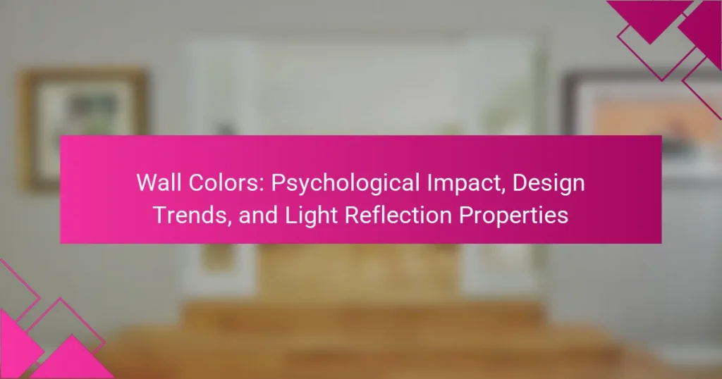
Wall colors are the various hues and shades applied to both interior and exterior surfaces, significantly influencing mood and atmosphere. This article explores the psychological impact of wall colors, highlighting how specific colors evoke emotions, such as calmness from blue and energy from yellow. It also addresses current design trends that favor bold hues, soft tones, and earthy shades, reflecting a desire for personalization and comfort. Additionally, the article examines the light reflection properties of wall colors, noting how light-colored walls enhance brightness while dark colors absorb light, thereby affecting the perception of space. Understanding these elements is crucial for making informed decisions in interior design.
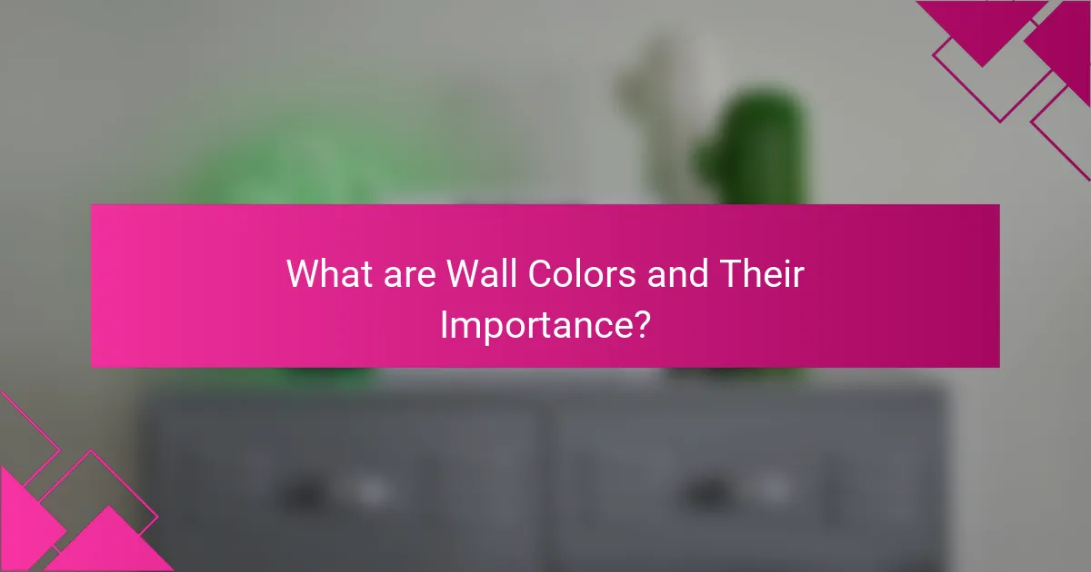
What are Wall Colors and Their Importance?
Wall colors refer to the various hues and shades applied to interior and exterior walls. They play a crucial role in influencing mood and atmosphere within a space. Different colors can evoke specific emotions; for example, blue is often associated with calmness, while yellow can stimulate energy. Additionally, wall colors impact light reflection, affecting how bright or spacious a room feels. According to research by the University of Southern California, color psychology reveals that color choices can significantly alter perceptions of space and comfort. Therefore, selecting appropriate wall colors is essential for achieving desired aesthetic and emotional effects in design.
How do wall colors influence our emotions and behavior?
Wall colors significantly influence our emotions and behavior. Different colors evoke distinct psychological responses. For example, blue is often associated with calmness and tranquility. Red, on the other hand, can stimulate excitement and energy. Yellow is linked to happiness and optimism, while green promotes a sense of balance and harmony. Research by the Institute for Color Research indicates that color can affect mood and productivity. The study found that 62% to 90% of snap judgments made about environments are based on color alone. Thus, wall colors play a crucial role in shaping our emotional experiences and behavioral reactions in various spaces.
What psychological effects do different colors have?
Different colors have distinct psychological effects on individuals. For example, blue often evokes feelings of calmness and tranquility. Research shows that blue can lower heart rates and reduce anxiety levels. Red, on the other hand, is associated with heightened emotions and can increase energy levels. Studies indicate that red can stimulate appetite and boost metabolism. Yellow is linked to happiness and optimism, prompting feelings of cheerfulness. Green is often seen as refreshing and restorative, promoting balance and harmony. Each color’s impact can vary based on cultural context and personal experiences, reinforcing the complexity of color psychology.
How can wall colors impact mood in various settings?
Wall colors can significantly impact mood in various settings. Different colors evoke specific emotional responses. For example, blue often creates a calming effect, making it suitable for bedrooms or relaxation areas. Yellow, on the other hand, can stimulate happiness and energy, making it ideal for kitchens or playrooms.
Research indicates that warm colors like red can increase feelings of excitement but may also lead to agitation if overused. In contrast, neutral colors such as beige or gray can foster a sense of balance and serenity.
A study published in the journal “Color Research and Application” by K. A. Küller et al. found that color schemes in environments directly influence mood and behavior. Thus, choosing wall colors thoughtfully can enhance emotional well-being in various spaces.
What role do wall colors play in interior design?
Wall colors significantly influence the overall aesthetic and atmosphere of interior spaces. They can affect mood and perception in a room. For instance, warm colors like reds and yellows can create a cozy and inviting environment. In contrast, cool colors such as blues and greens often promote calmness and relaxation.
Additionally, wall colors can impact the perception of space. Light colors tend to make rooms feel larger and more open, while dark colors can create a more intimate setting. According to a study by the Color Marketing Group, color choices can also affect how people feel in a space, linking specific hues to emotional responses.
Furthermore, wall colors can enhance or diminish natural light within a room. Lighter shades reflect more light, making spaces brighter, whereas darker shades absorb light, potentially leading to a more subdued atmosphere. Overall, wall colors play a crucial role in shaping the design and functionality of interior environments.
How do wall colors complement furniture and decor?
Wall colors complement furniture and decor by creating visual harmony and enhancing the overall aesthetic. The right wall color can either highlight or downplay the features of furniture and decor items. For instance, neutral wall colors can provide a backdrop that allows colorful furniture to stand out. Conversely, bold wall colors can make minimalist decor appear more dynamic. Color theory suggests that complementary colors create balance in a space. For example, blue walls can enhance warm-toned wooden furniture. Studies show that color can influence mood and perception, impacting how furniture is perceived in a room. Therefore, careful selection of wall colors is essential for cohesive interior design.
What trends in wall colors are popular in contemporary design?
Neutral tones are popular in contemporary wall color design. Shades like beige, gray, and white create a calming atmosphere. These colors serve as a versatile backdrop for various decor styles. Bold colors are also trending, particularly deep blues and greens. These hues add richness and depth to spaces. Pastel shades are gaining traction for their soft, inviting appeal. Earthy tones, such as terracotta and olive, reflect a connection to nature. Accent walls in vibrant colors create focal points in rooms. According to the 2023 Color Trends report by the Pantone Color Institute, these trends reflect a desire for comfort and sustainability in design.
What are the Current Design Trends in Wall Colors?
Current design trends in wall colors emphasize bold, saturated hues and soft, muted tones. Deep greens and navy blues are popular for creating a calming atmosphere. Warm neutrals like beige and taupe continue to be favored for their versatility. Pastel shades are trending for a softer aesthetic, particularly in bedrooms. Accent walls in vibrant colors add visual interest to spaces. Earthy tones are gaining traction, reflecting a connection to nature. Color blocking is a technique used to create dynamic and modern looks. These trends are influenced by a growing desire for personalization and comfort in home environments.
Which colors are trending in modern interior design?
Neutral tones, such as beige, gray, and white, are trending in modern interior design. These colors create a calming and versatile backdrop. Earthy hues like terracotta and olive green are also popular. They bring warmth and a connection to nature. Bold colors like deep blue and emerald green are gaining traction for accent walls. These shades add drama and sophistication to spaces. Pastel colors, including soft pink and light blue, are favored for their soothing effect. They enhance light and create an airy atmosphere. Overall, the trend leans towards a balance of calming neutrals and vibrant accents.
What are the most popular color palettes for 2023?
The most popular color palettes for 2023 include earthy tones, soft pastels, and bold jewel colors. Earthy tones such as terracotta and olive green are favored for their calming effect. Soft pastels like lavender and mint green provide a fresh, light atmosphere. Bold jewel colors, including emerald and sapphire, add vibrancy and depth to spaces. These palettes reflect current design trends emphasizing comfort and nature. According to design experts, these colors enhance mood and create inviting environments.
How do cultural influences shape wall color trends?
Cultural influences shape wall color trends by dictating preferences and associations with specific colors. Different cultures have unique meanings attached to colors. For example, white symbolizes purity in Western cultures but represents mourning in some Eastern cultures. These cultural associations impact consumer choices in home decor. Additionally, historical events and movements can shift color trends. The rise of minimalism in Western design has popularized neutral palettes. In contrast, vibrant colors may dominate in cultures that celebrate boldness and festivity. Market research shows that local customs and traditions significantly influence color selection in interior design. Thus, cultural context plays a crucial role in determining which colors are favored in wall design.
How can wall colors be used to create specific atmospheres?
Wall colors can significantly influence the atmosphere of a space. Warm colors like red and orange create energy and excitement. These colors are often used in social areas to encourage interaction. Cool colors such as blue and green promote calmness and relaxation. They are ideal for bedrooms and spaces meant for rest. Neutral colors provide versatility and can make a room feel larger. They serve as a backdrop for other design elements. Dark colors can create intimacy but may also make a space feel smaller. Light colors enhance natural light, making spaces appear airy. Studies show that color can affect mood and behavior, supporting the idea that wall colors shape our experiences in different environments.
What colors are best for creating a calming environment?
Soft blues, greens, and neutrals are best for creating a calming environment. Blue is often associated with tranquility and can lower heart rates. Research indicates that green promotes relaxation and a sense of balance. Neutrals provide a soothing backdrop without overwhelming the senses. These colors are commonly used in spaces meant for rest, such as bedrooms and meditation areas. Studies show that environments painted in these hues can significantly reduce stress levels.
How can bold colors energize a space?
Bold colors can energize a space by stimulating the senses and creating a vibrant atmosphere. They capture attention and evoke emotional responses. For instance, colors like red and orange are known to increase energy levels and enhance mood. Research shows that bright colors can improve focus and productivity in workspaces. Additionally, bold colors can make a room feel more dynamic and lively. They can also influence social interactions, making spaces feel more inviting. Overall, the psychological impact of bold colors contributes significantly to the energy of a space.
How do Wall Colors Affect Light Reflection Properties?
Wall colors significantly influence light reflection properties. Light-colored walls, such as whites and pastels, reflect a higher percentage of light, enhancing brightness in a space. Dark-colored walls absorb more light, resulting in a dimmer environment. For instance, a study by the National Institute of Standards and Technology found that white walls can reflect up to 80% of visible light. In contrast, dark hues may reflect as little as 10%. This difference in reflection can affect the mood and perception of space. Therefore, the choice of wall color is crucial for achieving desired lighting effects.
What is the relationship between wall colors and natural light?
Wall colors significantly influence how natural light is perceived in a space. Lighter colors reflect more light, making rooms appear brighter and more spacious. Darker colors absorb light, which can create a cozier but potentially dimmer atmosphere. The amount of natural light entering a room also affects the appearance of wall colors. For instance, a room with abundant sunlight may enhance the vibrancy of lighter shades. Conversely, in low-light conditions, darker colors may seem more subdued. Studies show that colors can alter the mood of a space, with light colors often associated with calmness and openness. This relationship between wall colors and natural light is crucial in interior design for optimizing ambiance and functionality.
How do different colors reflect or absorb light?
Different colors reflect or absorb light based on their wavelengths. Light colors, such as white, reflect most wavelengths and appear bright. Dark colors, like black, absorb most wavelengths and appear dark. For example, a red object reflects red wavelengths while absorbing others. This interaction is due to the pigment properties of materials. The specific absorption and reflection properties determine how colors affect light in a space. Research shows that lighter colors can enhance brightness in a room, while darker colors can create a more intimate atmosphere.
What impact do wall colors have on the perceived size of a room?
Wall colors significantly impact the perceived size of a room. Lighter colors, such as whites and pastels, tend to make spaces feel larger and more open. This is due to their ability to reflect light, creating an airy atmosphere. Darker colors, like deep blues or browns, can make a room feel smaller and more enclosed. They absorb light, resulting in a cozier but constricted feeling. Research by the National Institute of Health indicates that color perception is closely linked to the psychological effects of space. Therefore, choosing appropriate wall colors can effectively alter the visual dimensions of a room.
How can wall colors enhance or diminish artificial lighting?
Wall colors can significantly enhance or diminish artificial lighting. Light colors, such as white or pale shades, reflect more light, making spaces feel brighter. Dark colors, like navy or charcoal, absorb light, leading to a dimmer appearance. The reflectivity of paint finishes also plays a role. Glossy finishes reflect more light compared to matte finishes. According to a study by the National Association of Realtors, lighter wall colors can increase perceived brightness in a room. This effect is crucial in smaller spaces where maximizing light is essential. Therefore, the choice of wall color directly influences the effectiveness of artificial lighting.
What colors work best under specific lighting conditions?
Under natural light, soft colors like pale blue and light gray work best. These colors reflect light effectively, creating a bright atmosphere. In warm artificial light, warmer tones like cream and soft yellow are more suitable. They enhance the cozy feel of a space. Under cool artificial light, colors like deep blue and charcoal gray perform better. They create a modern and sleek appearance. Bright colors like white and vibrant hues can appear washed out under low light. Therefore, it is essential to consider the specific lighting conditions when selecting wall colors.
How can wall colors influence energy efficiency in a space?
Wall colors can significantly influence energy efficiency in a space. Light colors reflect more sunlight and natural light, reducing the need for artificial lighting. For example, white or pastel walls can increase daylight [censured], minimizing energy consumption. Conversely, dark colors absorb heat and light, which can lead to higher cooling costs in warm climates. Studies show that using lighter shades can decrease energy usage by up to 20%. Additionally, the choice of color can affect heating and cooling loads, impacting overall energy efficiency. Thus, selecting appropriate wall colors is crucial for optimizing energy performance in buildings.
What are some practical tips for choosing wall colors?
Choose wall colors by considering the room’s purpose and lighting. Light colors can make small spaces feel larger. Dark colors add warmth and coziness to larger rooms. Test paint samples on walls before deciding. Observe how colors change with natural light throughout the day. Consider the mood you want to create; blues promote calmness, while yellows evoke energy. Use a color wheel to find complementary shades. Finally, think about existing furniture and decor to ensure harmony.
Wall colors are the various hues applied to interior and exterior walls, significantly influencing mood and atmosphere within a space. This article explores the psychological impact of wall colors, highlighting how different shades evoke specific emotions and behaviors, as well as their role in interior design and current trends. It also examines the relationship between wall colors and light reflection properties, detailing how color choices can affect perceived space and energy efficiency. Additionally, practical tips for selecting wall colors based on room purpose and lighting conditions are provided.